
Ultimate Living: A Full Shopify Store Redesign, Start to Finish
Ultimate Living's Shopify store had broken nav links, leaking Liquid code, and a homepage image so large it was quietly taxing every visitor's patience. Here is what a full page reconstruction looked like, page by page.
Most conversations about Shopify store redesign start with a color palette. Ours started with a broken product link in the header navigation. When we began the storefront audit for Ultimate Living selling premium daily-greens supplements, the first thing we found wasn't a design problem. It was a link pointing to a product that no longer existed. That is usually a sign that the rest of the theme has quietly accumulated damage nobody has had time to clean up.
This is the story of a full storefront rebuild: homepage, five product pages, the cart, the collection page, and the supporting content, all reconstructed around a single editorial design system instead of a stock Shopify theme stretched past its limits. If you are weighing a Shopify conversion rate optimization project of your own, the diagnosis-to-rebuild sequence below is the actual playbook, not a marketing simplification of it.
The before state: a theme that had outgrown itself
Ultimate Living is a 30-year-old supplement company built around five hero formulas, led by a mother-daughter founding team, selling into a mature audience: women 50 to 75 who read design magazines, not fitness blogs. The existing storefront ran on a theme named, literally, "Landing Pages APR." That name told us what we needed to know before we opened a single page. It had been built for campaign landing pages, then pressed into service as the permanent home, product pages, and cart.
A public storefront recon (no admin access, just the live site and its sitemap) surfaced eight specific problems in the first pass:
- A broken header link. The main navigation pointed to
/products/brain-balance. The real product handle wasbrain-balance-2. Every visitor who clicked that nav item hit a 404. - Unrendered Liquid leaking into the page. Literal strings like
/products/{{productHandle}}were visible in the live HTML, a template that never got compiled, shipping to every customer. - Two Google Tag Manager containers, one of them dead. Every page load fired a 404 against Google's CDN for a container that no longer resolved.
- A promotional banner as the product's share image. The Open Graph image on the flagship product page was an "Ends in 24 Hours" urgency graphic, not a product shot. That image is what gets pulled into every social share and text-message preview.
- Tag chaos across the catalog. The flagship product carried 25 tags with no consistent taxonomy:
men,women,anti-aging,weight,general health, layered on top of leftover pre-order flags. Filtering could not work meaningfully against data like that. - One real merchandised collection out of six. The rest were duplicates, an outdated seasonal sale page, and a leftover sample collection from the original theme install.
- Two review apps running simultaneously. Yotpo on collection pages, Loox on product pages, doubling widget weight and creating two separate review feeds for the same products.
- A 1.7MB unresized founder photo loading on the homepage, uncompressed, unaccompanied by any responsive sizing.
Audit snapshot: 8 issues found in first pass
None of these were catastrophic on their own. Together, they described a storefront that had been extended feature by feature for years without anyone stepping back to ask whether the whole thing still made sense. That accumulation is the real argument for a full ecommerce page rebuild instead of a spot fix. You can patch a broken link in an afternoon. You cannot patch a theme's entire information architecture one ticket at a time and expect it to add up to a coherent site.
What the behavioral data confirmed
A short Microsoft Clarity scan of Ultimate Living's top landing pages, run before the rebuild, gave us session-replay evidence to match the code audit. The brand's "Our Story" page, a page meant to build trust with a skeptical, older buyer, graded out as critical friction: dead clicks, quickback behavior (visitors leaving within seconds of landing), and a live JavaScript error, across 20 real sessions in a 3-day window. A second high-traffic landing page graded "needs work," with nine script errors firing across 27 sessions and 100% average scroll depth, meaning visitors were scrolling the entire page looking for something the layout wasn't giving them fast enough.
Average scroll depth on the audited landing pages was 76%. Visitors were reading. The page just was not converting that attention into anything.
That is the pattern that makes a Shopify store redesign worth doing instead of a small tweak: engaged traffic hitting a page that technically loads but structurally fails to close the sale.
The diagnosis: an editorial brand trapped in a supplement-aisle template
Underneath the bugs was a positioning problem. Ultimate Living's own foundation research was explicit: the buyer is 55 to 75, reads Architectural Digest and Kinfolk, and does not shop the way the AG1-and-Ritual crowd shops. She is not optimizing a stack. She is deciding whether to trust a company with her health, and she is doing it the way she trusts everything else in her life: slowly, and on evidence.
The existing theme did not know that. It rendered the brand in the visual grammar of a generic Shopify template: card grids, stock section layouts, a campaign-page skeleton wearing a permanent-site costume. Ultimate Living's own design brief named the gap directly: the page needed to read like Kinfolk or Cereal magazine, not like a Shopify template. Every additional card grid, every default section, pushed the storefront further from the register that would actually earn trust with this specific buyer.
This is the core lesson behind most ecommerce homepage optimization work that actually moves numbers: the fix is rarely "add more urgency" or "add more badges." For a mature, skeptical audience, the fix is often the opposite: remove noise, add real proof, slow the page down on purpose.
The persona that shaped every layout decision
Foundation research also surfaced a second buying behavior worth naming, because it changed how the buy box was built. A meaningful share of Ultimate Living's purchase value traces to women buying not for themselves but for a spouse who "feels fine" and will not change his diet. That buyer is not shopping a feature list. She is looking for proof that will survive her husband's first objection: heavy-metal testing, a pharmaceutical-standard manufacturing claim, a taste guarantee. Every trust element on the rebuilt product pages had to answer an objection a real skeptic in the household would raise, not just list ingredients.
The rebuild: homepage, PDPs, cart, and the pages between them
The rebuild covered the full storefront, not a single landing page. Here is what changed and why, section by section.
Homepage
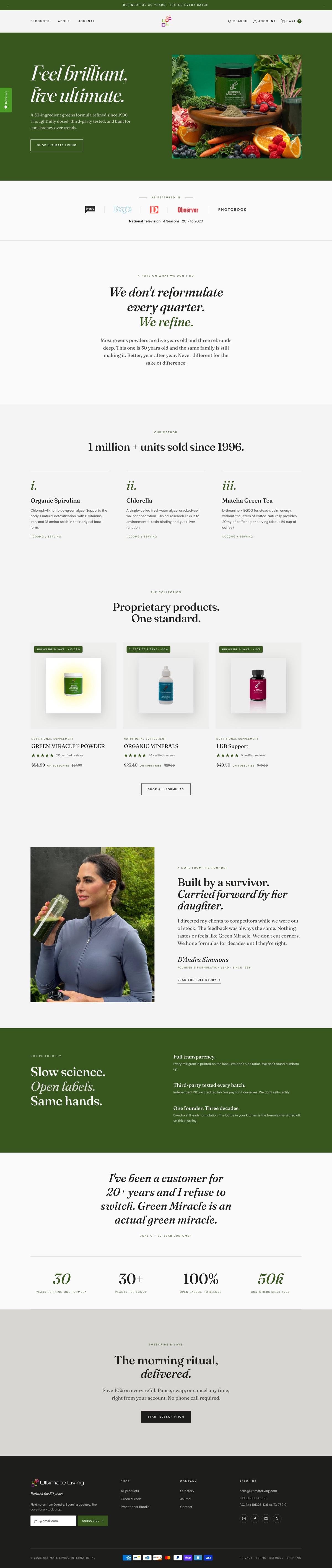
The homepage moved from a generic hero-plus-grid layout to a two-column editorial rhythm: a single-product hero shot with generous negative space, a Fraunces serif headline carrying one italic accent in forest green, and section bands that alternate cool-ash and near-black ink grounds to create movement without adding visual noise. The 1.7MB unresized founder photograph, the single biggest performance liability on the page, was re-encoded to a properly sized JPEG at roughly one-sixth the file size, with the homepage template updated to reference it directly.
Product pages (all five SKUs)
This is where most of the Shopify product page optimization work landed, because the product page is where Ultimate Living either earns the sale or loses it to hesitation. Each of the five product pages received:
- A dedicated, product-specific lab-testing band. Previously, only the flagship formula had real testing data; the other four rendered generic schema defaults. Each product now carries its own six-point testing summary (heavy metals, microbial screening, potency, and the specific methodology used, ICP-MS for minerals, HPLC for botanicals) instead of a copy-pasted placeholder.
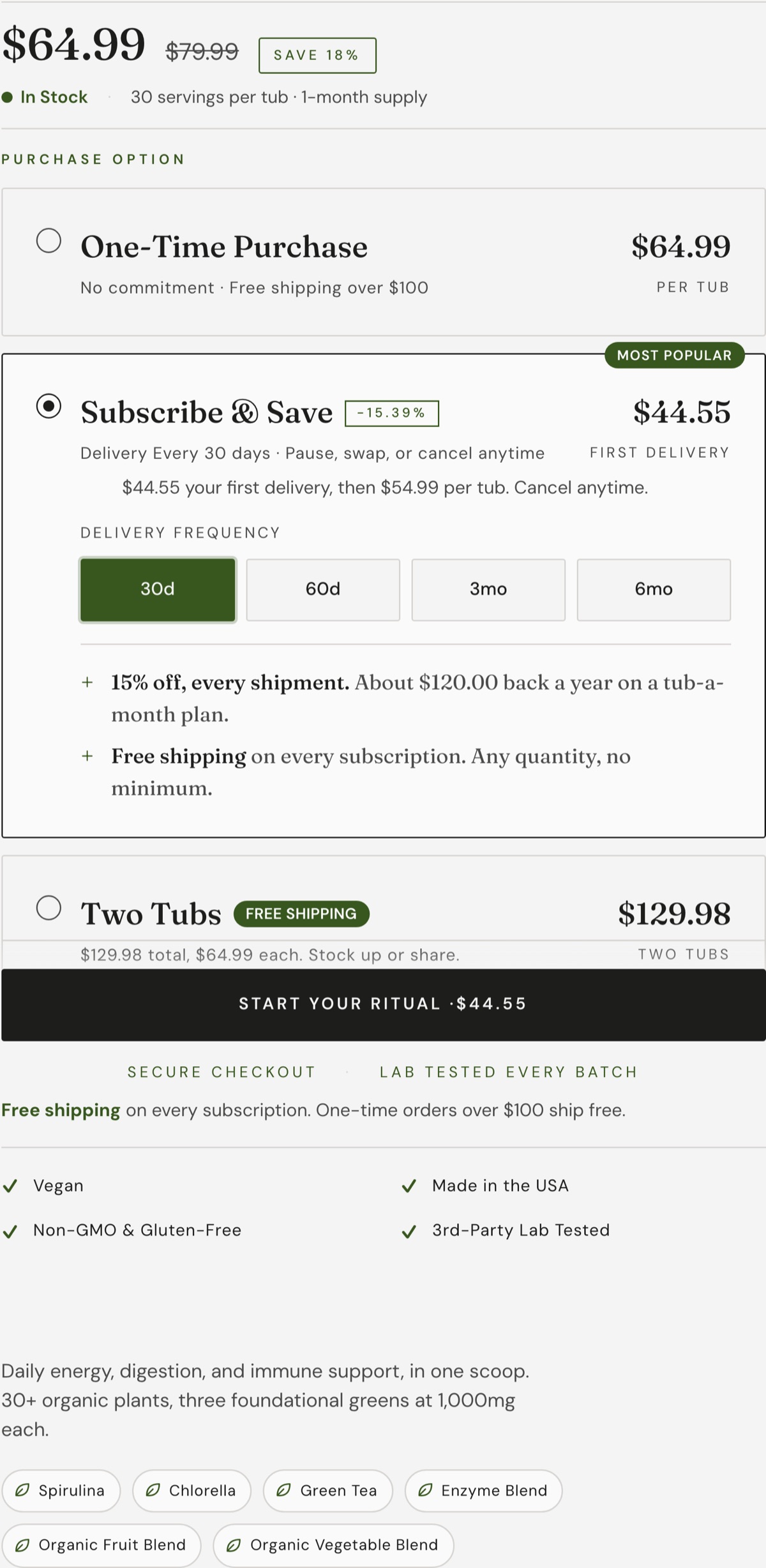
- A rebuilt purchase-option card. Subscribe-and-save and one-time purchase render as a stack of selectable rows rather than a dropdown, with the selected state carrying a visible forest-green border so the choice is never ambiguous.
- A sticky mobile checkout bar that appears once a visitor scrolls past the primary buy box, so the add-to-cart action is never more than a thumb's reach away on a phone.
- Removal of a dead quantity-selector bug that was appearing on a bundle product where it made no sense (a bundle has one SKU, not a quantity choice), traced to an orphaned schema block left over from a previous theme edit.

Collection and cart
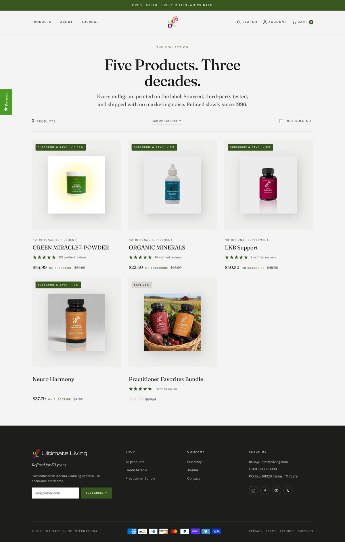
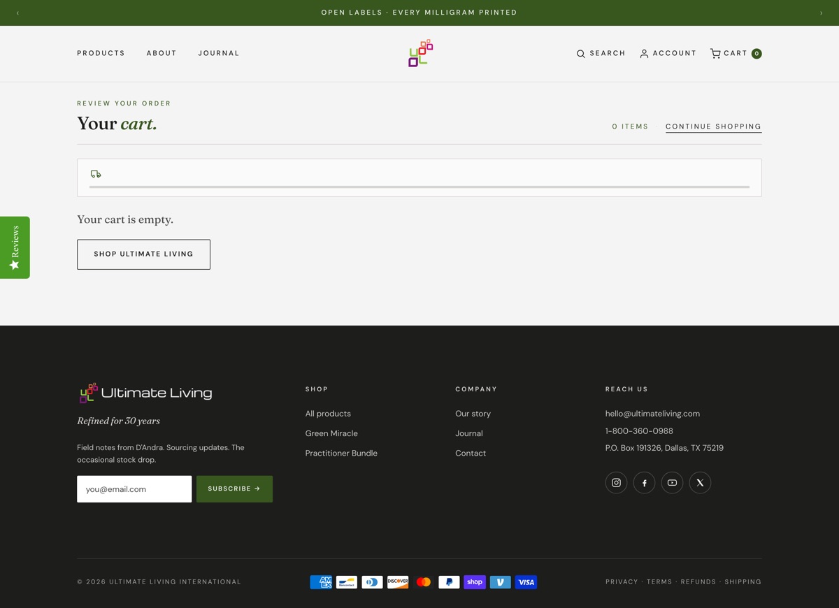
The collection page dropped from six cluttered collections (duplicates, an outdated seasonal sale, a leftover sample collection from the original theme install) down to the storefront's one real merchandised grouping, with a working sort control added client-side. The cart page went through the deepest rework: shipping messaging was fixed to state "Free" above a real subtotal threshold or "Calculated at checkout" below it (the old cart displayed a flat estimated shipping fee that did not match what checkout actually charged), a gap-aware upsell rail was added that tells a shopper exactly how much more they need to add to unlock free shipping, and a compact review widget was pinned to the best-reviewed product so the cart never renders without social proof nearby.
Navigation and trust elements
The header's "Science" link, which pointed to a page anchor that no longer existed on most templates, was replaced with a direct link to the full product collection. The Open Graph image on the flagship product, previously a countdown-urgency promotional banner, was flagged for replacement with an actual product shot. Across every page, the two competing review apps were consolidated onto one system so ratings render once, consistently, instead of twice with different numbers.
Design decisions and the CRO reasoning behind them
A few choices are worth explaining in detail, because they are the ones most DTC brands get backwards.
Near-square corners and flat surfaces instead of shadows and rounded cards
The design system specifies a 2px corner radius, nearly square, and bans drop shadows entirely. Depth comes from hairline borders and tonal shifts between cool-ash and card-white, never a soft gray glow. For most DTC brands chasing a friendly, approachable feel, this reads counterintuitive. For a buyer who associates rounded bubbly cards and drop shadows with mobile games and impulse-buy apps, the flatter, more architectural surface reads as more serious, and more trustworthy, which is exactly the trade Ultimate Living needed.
One saturated color, used sparingly
Forest green is the only saturated color in the entire system, and it is capped at roughly ten percent of any given screen: the buy button, the in-stock indicator, one italic word per headline. Every other surface is a cool, near-monochrome gray. This is a direct rejection of the neon-green, gym-coded aesthetic that dominates the greens-powder category. Ultimate Living's own positioning research named this explicitly: it does not compete in the same visual neighborhood as the AG1-and-Athletic-Greens crowd, and a storefront that borrowed their visual language would have undercut the very trust it was trying to build.
A ruled figure list instead of a metric-card grid
Where a typical Shopify theme would drop three stat cards in a row ("30 Years," "Heavy-Metal Tested," "5-Star Rated"), the rebuilt system uses an editorial ruled list instead: a large serif figure in forest green, a plain-language descriptor beside it, separated by hairlines top and bottom. It reads like a page from a print magazine's fact box, not a SaaS landing page. For an audience that responds to concreteness over marketing gloss, that register match matters more than the content of the stat itself.
Results: what a page-by-page technical and behavioral audit actually validates
Be precise about what this data does and does not show. The rebuilt theme was staged and fully QA'd on a non-public development theme, pending the client's publish authorization, so we do not yet have post-launch revenue or conversion numbers to report, and we will not invent any. What we can report, honestly, is the delta between the audited before-state and the verified after-state, which is itself the leading indicator every Shopify CRO project runs on before the traffic numbers catch up.
Before vs after: verified deltas
Hero image
1.7MB to 288KB
Lab testing
1 of 5 to all 5
Theme check
Zero errors, 22 routes pass
- Code health: the rebuilt theme passes Shopify's official theme linter at zero errors. The original theme's broken nav link, leaking Liquid placeholders, and dead tracking container do not exist in the rebuild.
- Full page inventory: a 22-route smoke test returned the expected status on every route, with zero Liquid error markers and zero missing alt attributes.
- Performance: homepage hero image dropped from 1.7MB to 288KB, an 83% file-size reduction.
- Trust surface: lab-testing data went from 1 of 5 products to all 5, each with product-specific methodology.
- Cart accuracy: shipping-cost display now matches the real checkout total exactly.
As an estimate, not a measured result: pages that previously graded "critical" and "needs work" in behavioral friction scans, carrying dead clicks, script errors, and quickback exits on a trust-building page, are the kind of pages where removing friction typically produces the largest lift in a redesign, because the traffic and the intent were already there. The 76% average scroll depth on the old landing pages tells us visitors were reading. A cleaner, faster, more trustworthy page gives that attention somewhere to convert.
Takeaways for any DTC brand considering a redesign
A few lessons here transfer past supplements and past this one brand.
- Audit before you redesign, and audit in public. A broken nav link, a dead tracking pixel, and leaking template code are all things a customer can see or silently experience even if nobody on the team has noticed. Before spending a dollar on new visuals, crawl your own site the way a stranger would. Most of what needs fixing is not a matter of taste.
- Your theme's visual register has to match how your specific buyer actually shops, not how your category shops. Ultimate Living's competitors sell with neon greens and gym energy. This brand's actual buyer was repelled by that register. Copying category convention is often the opposite of what your buyer needs.
- Trust data has to be specific, not shared. A single lab-report placeholder copied across five products is worse than having none, because an attentive buyer will notice the copy-paste. Every product's proof should be about that product.
If your own storefront has accumulated the kind of drift this one had, the fastest way to find out is a straightforward technical and behavioral pass, not a guess. We run that as a free store health scan, the same category of audit that started this project. For more on how we approach a full rebuild, see our method, or read more case studies from other stores we have taken through the same process.